Note 1
Note taking and the design of everyday things
What are my notes?
I write down a lot of notes each week about things that I’m either working on or reading about. This note section will be a place for me to openly share some of them.
I read a blog post by Simon Späti about digital gardens a few years ago and liked the idea about being slightly more methodical in my note taking. The notes I’ll write here will be rough, feel less polished, will contain a mixture of topics, and potentially the odd typo; some topics may become blog posts, some may not.
People often get quite detailed about how they conceptualise and define different methods of note taking, such as the Zettelkasten approach. I’m not fussed. I have a pretty simple system. Rough notes to capture my thoughts. Blog posts to reason about them.
We often spend a lot of time reading (or idly consuming) the thoughts of others, whether that be through books, news articles, podcasts, posts on X, Substack, LinkedIn, and many other mediums. However, I think it’s equally as important that we form a habit of writing down our own too.
The design of everyday things:
I started reading a book called The Design of Everyday Things written by Donald A. Norman. I’m 30 pages in and it’s making me think about the image below that often gets cited when people talk about overly complicated, obscure user interfaces and applications.
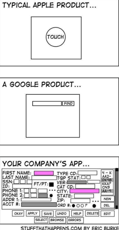 Image usually attributed to Eric Burke's stuff that happens blog.
From experience, the above is definitely still an issue and probably always will be. I’ve seen, have had to use, and have been told about some pretty nightmarish systems in my time. One of my past housemates, who works in the NHS, would often talk about the Black PAS system. Given the sensitivity of the information on there, I’ve never been able to consult Black PAS directly. However, after a few Google searches, I did stumble upon a seeminly similar PAS system on an accessing test results page from Gloucestershire Hospitals NHS Foundation Trust’s website.
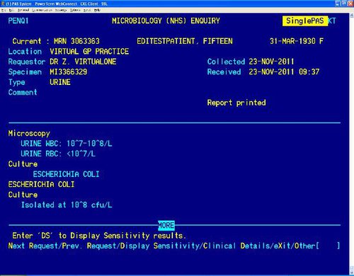 Now then....
The image is accompanied with instructions such as:
When viewing results please look out for “MORE” appearing at the bottom and/or top of the result section (see PENQ screen 1). This indicates that more result information is available. Use Ctrl-F3 or type “PD” to scroll down and use Ctrl-F2 or type “PU” to scroll up.>
I have other family members working in the NHS and Prison Service who tell me about similar systems. I may write a follow-up note to include them as additional examples.
Anyway, the book is making me think deeply about how we communicate through interfaces what is possible and can be achieved when using a given product (affordances, signifiers, etc, are terms used in the book); it’s fascinating how the opporutunity for confusion to arise is always there, lurking.
I’ll start putting some of these thoughts into practice as I improve the USRN Engine. It’s an application intended to simplify how people access the wide variety of information that can be collected against Unique Street Reference Numbers (USRNs). The intial target audience is those working in street works planning. I’ve written many a post/blog about USRNs so feel free to read those if you’re reading this and thinking what on earth is he on about.
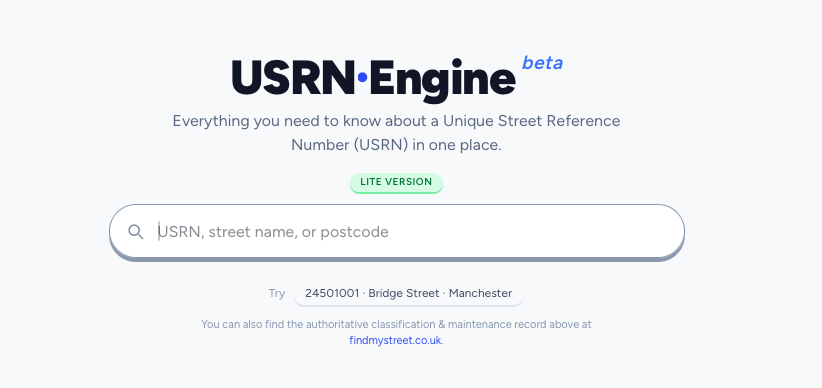 Main search component of the USRN Engine....
Through doing this work, I often find myself ruminating about the following question: What is the least amount of input required from a user to get the most amount of useful information back to them?
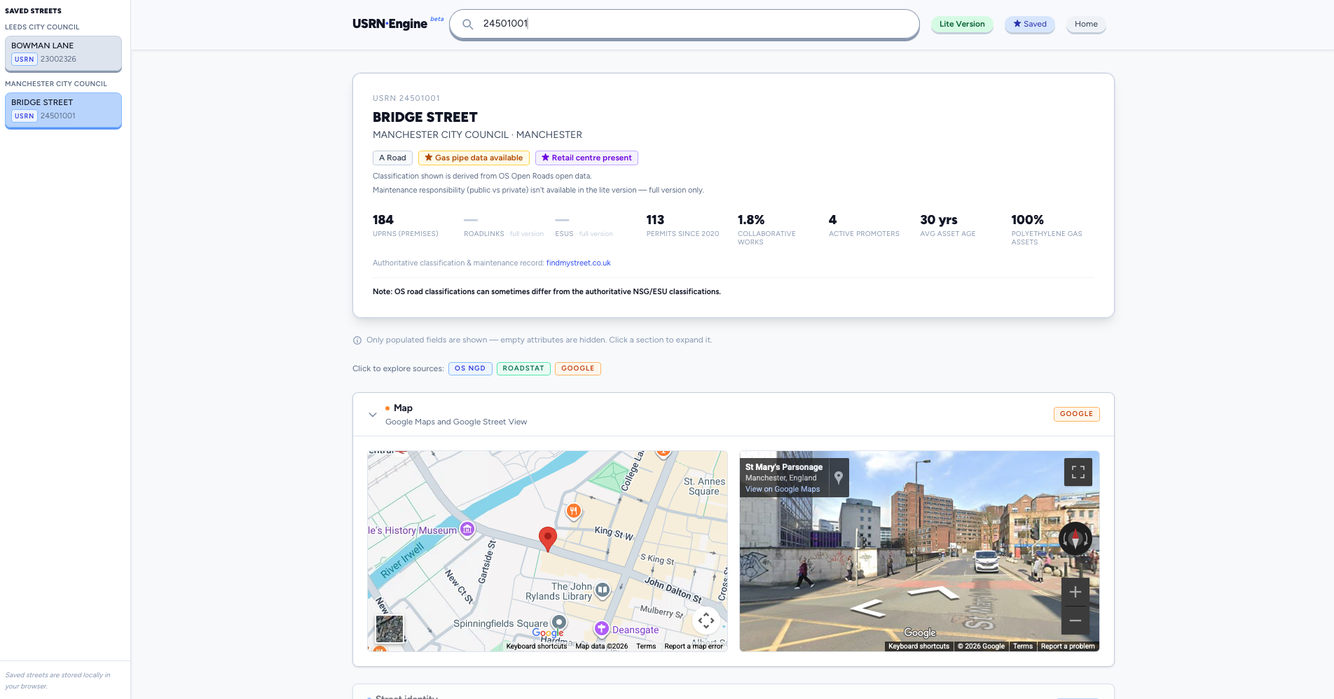 Active search component of the USRN Engine....
Well designed user interfaces are important for this, but a lot of the work I do on the USRN Engine is spent on data ingestion and trasnformation processes.
Good UX yes. Good data design, yes as well.